How loyal are your customers? If you business is like most brands, your answer is probably going to be complex and constant in flux. To accurately gauge customer loyalty, you need data from a variety of sources such as customer transaction data, social media data, and customer survey data. But what If you don’t have such data readily available or if you don’t have the analytic capabilities to tackle such data? It is still possible to use common tools to form a crude picture of your customers’ loyalty levels. In this article, I would like to talk about creating a customer loyalty dashboard in Google Analytics.
This article assumes that your website already uses Google Analytics. If you use one of the other web analytics tools instead, the basic ideas should still carry, although the exact terminologies and metric definitions may be different. This recommended dashboard should be applicable to most businesses. But it is particularly relevant to businesses where visits to the website is an important part of how your existing customers interact with you. This may apply, for example, to an online store or an online content provider (e.g., a blog).
Google Analytics Dashboard Brief Overview
(Note: I am keeping this general introduction very brief as I assume that you are more or less familiar with Google Analytics already and may even use the dashboard function. If you are not, a great resource for learning more about Google Analytics is the Google Analytics Academy. If you want to learn about dashboards specifically, check out the “About dashboards” section in Google Analytics Help.)
Google Analytics dashboards allow you to assemble several widgets to create a quick overview of how your website is doing. Since multiple dashboards are possible, you can create individual dashboards around certain themes such as customer loyalty or business growth. To access Google Analytics dashboards, click “CUSTOMIZATION” then “Dashboards” in the left panel. (If you only see a list of icons instead of actual links on the left side of your Google Analytics screen, click on any of the icons will expand to the full menu.) Click the “CREATE” button to create a new dashboard. Select “Blank Canvas” and enter a name for the dashboard in the small window, and click “Create Dashboard”. This creates a blank canvas that you can add different widgets to.
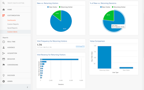
When creating dashboards in Google Analytics, my philosophy is to focus on the critical few. A large dashboard with lots of information defeats the whole purpose of a dashboard, which is meant to help you take a quick pulse of your website. I usually keep each of my dashboards not more than 6~8 widgets. Now let’s take a look at the five widgets I recommend for your customer loyalty dashboard (see a screenshot of the entire dashboard).
New vs. Returning Visitors
If website interaction is an important part of your business, higher customer loyalty should translate into a higher portion of your users coming back to your website. You can capture this by creating widgets comparing the proportion of new vs. returning visitors.
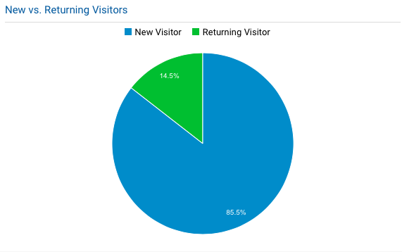
The “New vs. Returning Visitors” widget tells you what percentage of your visitors are new to your website vs. have been here before. If your customers are more loyal, you should see them coming back to your website more. This translates into a higher percentage of return visitors. In the image above, there were 14.5% return visitors and 85.5% new visitors during the specified time period.
To set up this widget, select “Add Widget” and use the settings below:
- Standard: PIE
- Create a pie chart showing: Users
- Grouped by: User Type
- Link to Report or URL: Audience / Behavior / New vs Returning (This specifies where you will go if you click on the title of the widget.)
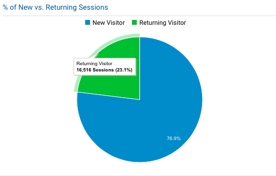
You can define another “% of New vs. Returning Sessions” widget by looking at the percentage of all browsing sessions that were completed by new vs. returning visitors. The difference is that this is based on the total number of browsing sessions, rather than the total number of people, as one person can make multiple visits. You can use almost the exact same settings as the widget above, except that you’ll select “Sessions” for the “Create a pie chart showing” option.
Interpretation Notes:
- The definition of a return visitor is not perfect in Google Analytics. If a user clears the browser cookie or if the user switches to a new browser or device he/she has not used before, the user will be considered a new visitor for that first visit after clearing the cookie or switching the device. This means you should not take the percentages too literally. But assuming such situations happen somewhat randomly, looking at the trend across different time periods should still help.
- There is no good rule of thumb for these percentages. They depend on your business life cycle and on your marketing campaigns. If your business is in a quick expansion stage, or if you spend heavily on customer acquisition campaigns, you may see a relatively low percentage of returning users. Again, monitoring these metrics across time is helpful. But be mindful that if you start a new customer acquisition campaign or if one of your campaigns is unusually successful, expect to see a dip in the percentage of returning visitors and sessions.
- By definition, you will see a higher percentage of returning visits when defined by sessions than by visitors. This is because while each new visitor can be associated with only a single session (after that it’ll be considered return visits), return visitors can be associated with multiple sessions.
Visit Frequency and Recency
How often do your customers come back to your website? More loyal customers should come back to your website more often. The two widgets to capture these are “Visit Frequency for Returning Visitors” and “Visit Recency for Returning Visitors”.

The “Visit Frequency for Returning Visitors” widget tells you on average how many times each of your returning visitors come to your site during a specific time period. The image above shows that for this website, each returning user came 1.74 times during the specified time period. The squiggly line on the right side of the widget shows you the daily trend for this metric during that time. But this daily information is not very informative for most websites. Unless you are Facebook, Twitter, or one of the news websites, people are probably not likely to come to your website multiple times a day. I will get to the time selection issue later in the article.
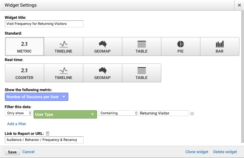
To set up this widget, follow the settings in the image below. For this widget, it is important to filter the data so that only sessions by returning visitors will be included. See the setting under “Filter this data:” in the image.
The second “Visit Recency for Returning Visitors” widget shows a distribution of how many days elapsed between two sessions by the same user. This metric can tell you how often people are coming to your website. Let’s say customer A visited your website on Monday and she came back again on Wednesday, it would be two days between the two sessions. This widget shows the top nine time intervals between visits. Since more loyal customers are likely to interact with you more often, you will want to see small numbers of days among these top intervals. In the image below, all top time intervals are around or within a week.
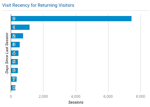
To set up the “Visit Recency for Returning Visitors” widget, use the following settings. Again, be sure to filter the data to include only returning visitors.
- Standard: BAR
- Create a bar chart showing: Sessions
- grouped by: Days Since Last Session
- Show up to: 9 bars
- Check the following options: Use a horizontal version of this chart; Show values of the vertical axis; Show values of the horizontal axis; Show title of the vertical axis; Show title of the horizontal axis.
- Filter this data: Only show – User Type – Containing – Returning Visitor
- Link to Report or URL: Audience / Behavior / Frequency & Recency
Interpretation Notes:
- It is important to recognize that the visit recency here is different from the typical recency definition in marketing. The recency here is the number of days between a returning user’s two visits. For example, if you have a session with a days-since metric value of 35, it means that the previous visit by the same user happened 35 days before that session. It does NOT mean that the same user hasn’t come to your website in the last 35 days (typical recency definition).
- For visit recency, it is normal to see a lot of sessions having 0 day since last visit. For some sessions this may be because someone came back to your website again on the same day. But most of the time, it is because it was the first visit the visitor made to your site. Because there was no prior session, the days-since metric is automatically set to 0 in such cases. I typically ignore the 0 day cases. But if people are likely to return to your website multiple times a day to check updates, the 0-day cases may be informative to you.
- Average visit frequency may not reflect the wide range of visit frequencies by your returning customers. To see a distribution of visit frequencies, click on the title of the widget to go to the Frequency & Recency area (assuming you have set the link properly in the widget setting as specified earlier).
Customer Value
Loyal customers are expected to generate more value for a business. So if we were to compare a return customer’s value with that of a new visitor, we should see a higher value. The “Value Comparison” widget gives this information. It compares the value of a returning visitor with that of a new visitor. In the chart below, the average order value of a returning visitor was $117.75, much higher than the average order value of $82.56 for a new visitor.
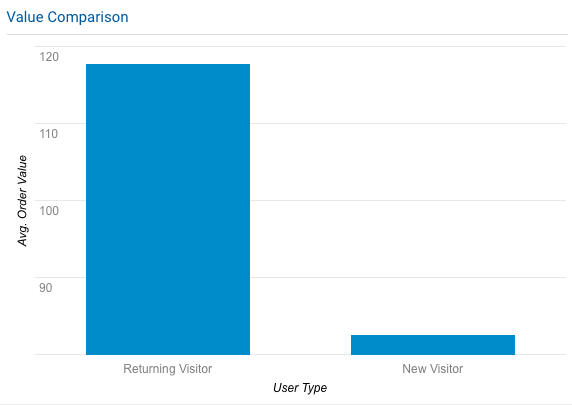
To set up this widget, use the following settings:
- Standard: BAR
- Create a bar chart showing: Avg. Order Value (see other possible options for this field below)
- grouped by: User Type
- Check the following options: Show values of the vertical axis; Show values of the horizontal axis; Show title of the vertical axis; Show title of the horizontal axis
- Links to Report or URL: Conversions / Ecommerce / Overview (if you choose the first two value types below) or Conversions / Goals / Overview (if you choose the third value type below)
The sample chart earlier shows average order value. Depending on the type of website you have and how you set up Google Analytics, you want to use the type of value most suitable for your situation. The following are the most common three:
- Avg. Order Value: the average amount spent in a transaction, suitable if you have set up and enabled ecommerce tracking for your website.
- Per Session Value: the average revenue for each session. This also requires ecommerce tracking in Google Analytics. Since not all sessions involve an order, this value is typically much lower than average order value. For example, for the same website used in the chart earlier, the per session value was only $3.24 for returning visitors and $0.40 for new visitors. While these values are much lower, they actually reflect a bigger gap between returning visitors and new visitors (a whopping 710% more instead of 43% more for average order value). This is because returning visitors are more likely to convert than new users. Therefore, per session value is more suitable if you also want to include conversion rate differences in the value metric.
- Per Session Goal Value: instead of using order amount to calculate the value of each session, this metric uses values defined by your website goals. This value is suitable if your website is not an e-commerce website, or if you have not set up Google Analytics to track orders and order values. All you need for per session goal value is to set up goals for your website (e.g., visit specific pages or fill out a contact form) and associate a monetary value with each goal. See this guide on how to set up goals in Google Analytics if you are not familiar with the goals function.
Interpretation Notes:
- A returning visitor may not necessarily be a repeat buyer. It could be someone who has visited your website multiple times but has never made a purchase before. If you prefer to compare those who have purchased before with those who have never purchased, you will want to use different user segments in association with the dashboard instead. For more information on creating user segments, see the Google Analytics Help section on segments.
Time Period Setup
As a final point, I want to talk a little bit about selecting the appropriate time period for the dashboard. As other Google Analytics report pages, you can select the time period that the dashboard generates information from. How long a time period should you choose? Customer loyalty is a long-term concept. Defining customer loyalty at too short of a time interval (e.g., daily) is meaningless in most cases. For a typical website, I would suggest using a monthly time interval. If your website is visited infrequently even by the most loyal customers, you may want to use a longer time interval such as a quarter.
Because the values of the metrics suggested here vary widely from business to business, it is useful to compare with your own history to get an idea of whether you are doing better or worse. To compare, check the “Compare to” box in the time period selection window. You can compare to the previous period (the period immediately prior to the selected time period), previous year (same period last year), or another custom-defined time period.
Further Resources
To help you implement the dashboard, I have just added it to the Google Analytics Solutions Gallery as a template. Please feel free to download and implement the template in your own Google Analytics account. In the template, I included an optional widget on traffic source. The relevance of this widget depends on your marketing practice. Generally speaking, loyal customers are more likely to come to your website by either typing the address of your website or through their bookmarks. So you are likely to see a higher percentage of “Direct” traffic as loyalty level increases.
I hope you find the customer loyalty dashboard suggested here useful. If you need help with using Google Analytics for your business, I teach a Web Analytics course to the digital marketing and analytics students at my university. We always welcome real-world partners for potential course projects. If you are interested in working with my class, please fill out the Contact Yuping form to reach out.
